Hope your week is off to a great start!
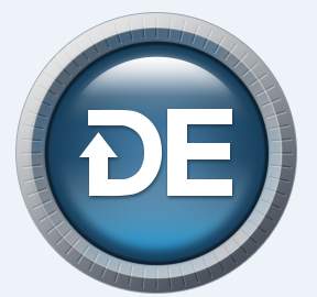
Have you seen the new logo that we are about to launch here?

It is a simple yet modern mark for Driver Easy. We believe that the inverse letter D on the left side and letter E combined contributes a more user-friendly image of Driver Easy.
How do you think about this? Do you have anything to say to us regarding this new logo?
Or do you have more attach to the old logo?
Your suggestions and advice will be considered and/or even adopted us.
If you have anything you want to say about this logo, we are all ears.


